
Amalgamated Creative Poster-Zine
PROJECT FOCUS
Design Theory and Modality
Illustration and Vector Art
Composition and Layout
Typography
Hierarchy
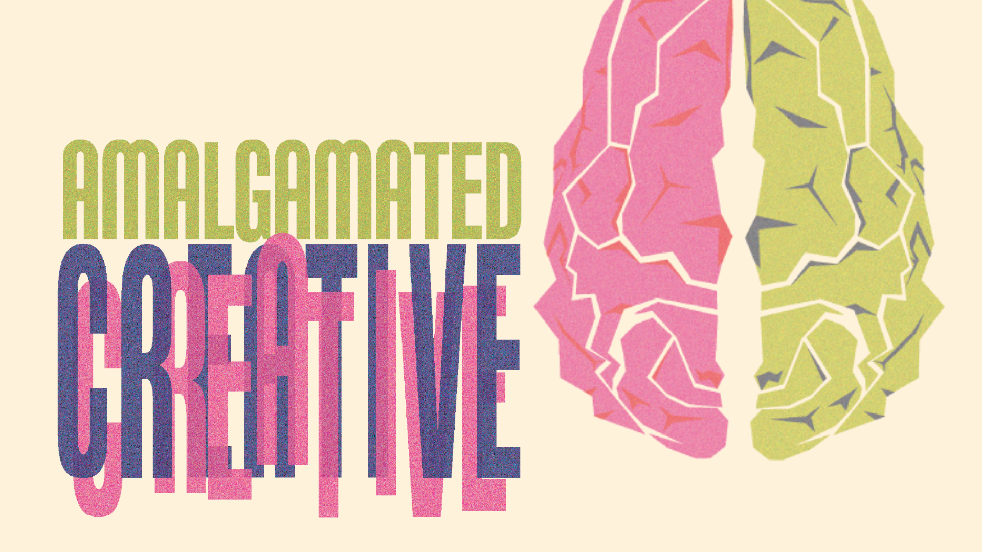
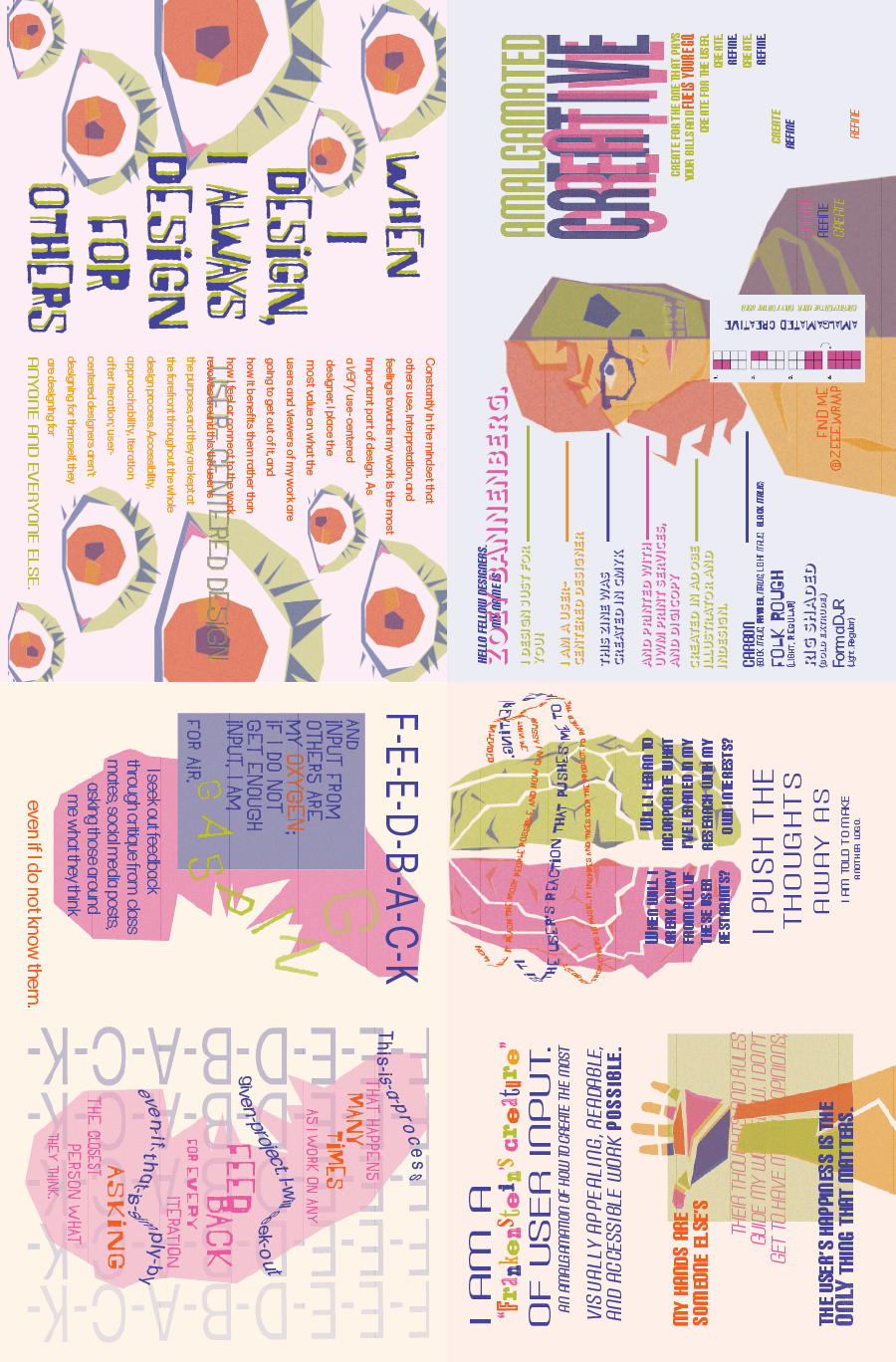
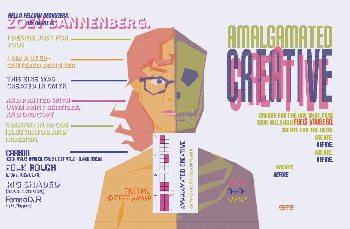
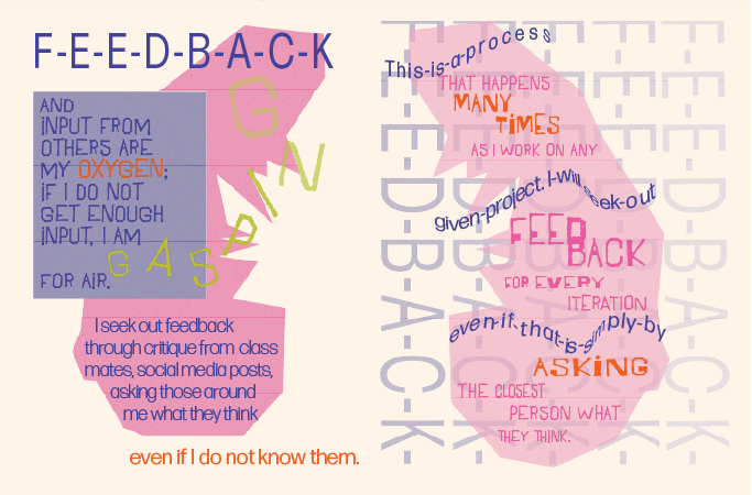
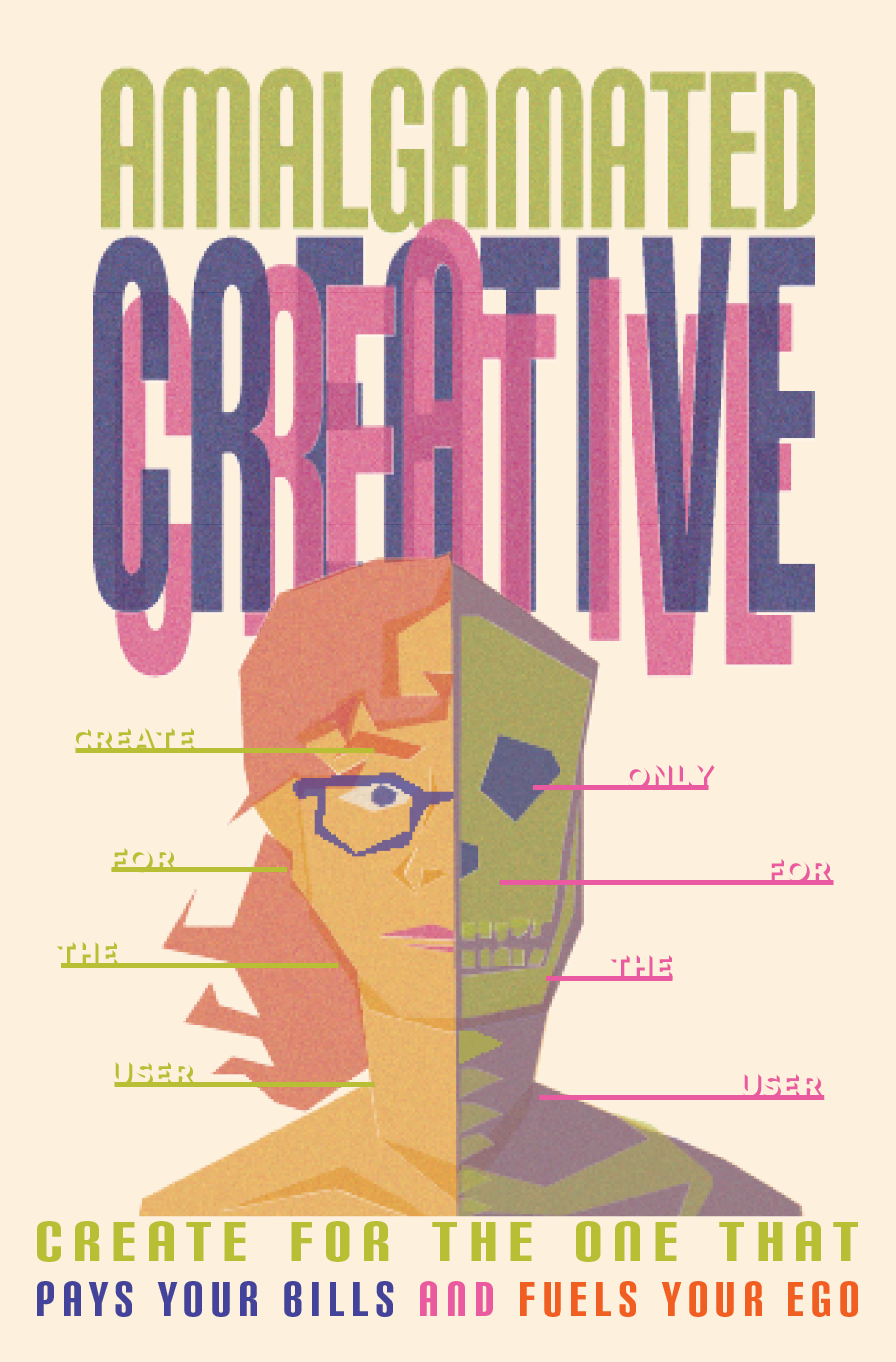
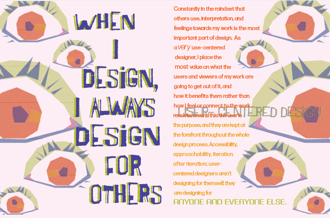
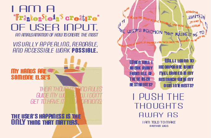
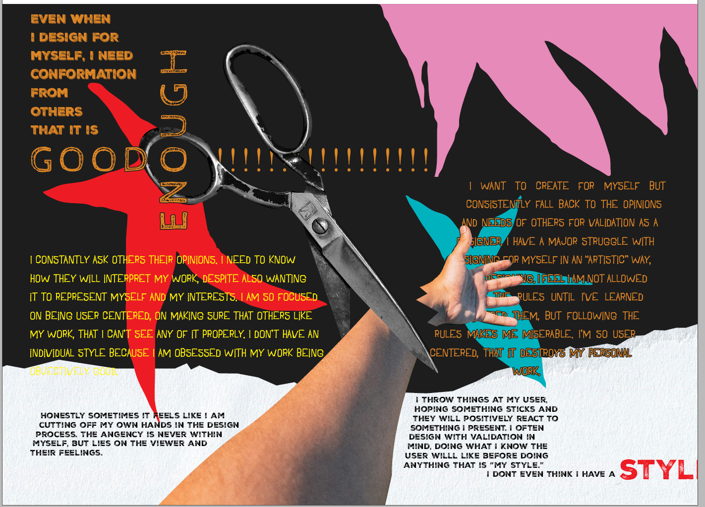
Amalgamated Creative is a zine that engages designers and non-designers alike, showcasing my design modality as a user centered designer, and how much I consider client and user feedback in the process. Illustrations of different organs and body parts drive home the way that I put my whole self into each and every design I create. The zine utilizes strong color and typography choices to create an overall cohesive yet explosive reading experience. The written portions take the viewer on a journey through my thoughts as a designer, and the push and pull of my process, as well as my relationship with my practice. Amalgamated Creative also showcases my ability to bend conventional boundaries, exploring what it means to purposefully break the rules, and try new things as a designer. Not only does the reader get to experience the zine, but once unfolded, they also engage with a cohesive poster that highlights my ability to form strong typographical hierarchy and create illustrative elements that can exist in multiple forms. The zine is also accompanied by a hand constructed belly band and insert card that further the engagement the viewer has with the zine.
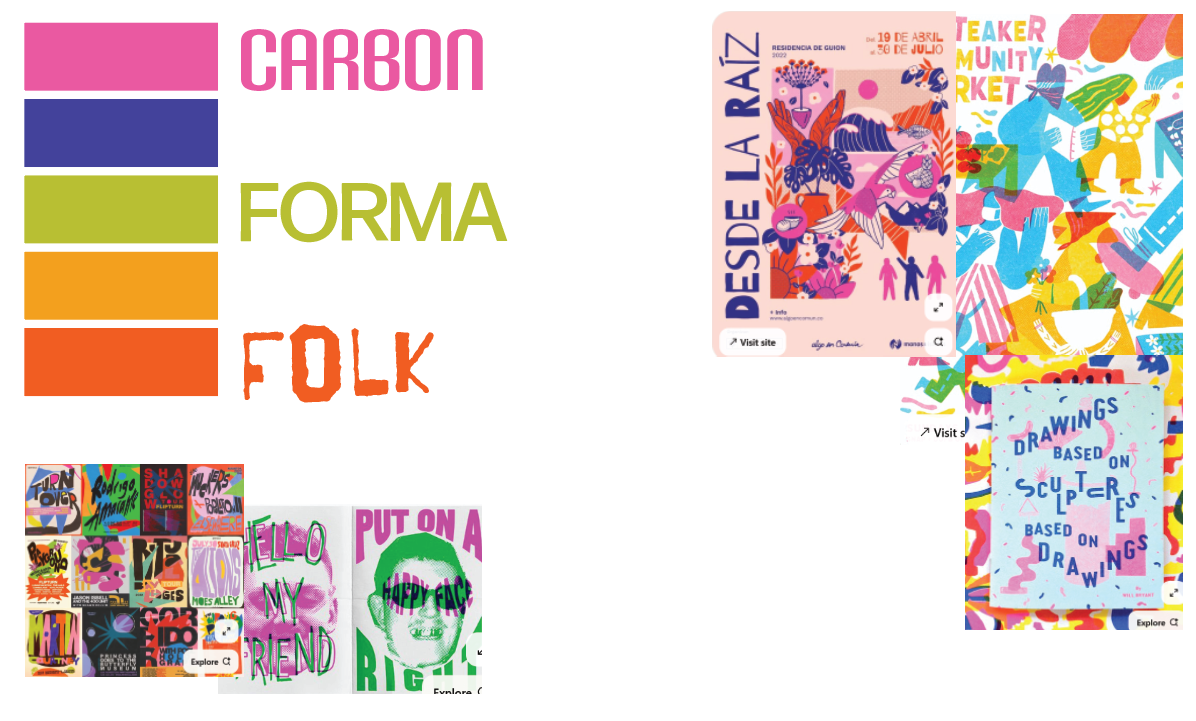
Type and Color

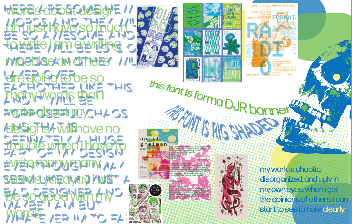
With a wild and seemingly chaotic array of typefaces in this project, I aimed to create a sense of amalgamation: thrown together approach to design built up by different styles and techniques I have acquired through my education and experience. Similarly, the color palette is inviting for a reader, while also being varied and bright, making the experience for the reader similar to mine when I design.
Illustration
Vector based images created in Adobe Illustrator are representative of the human behind my designs, as well as the way that I put my whole being into all of my work. Regardless of the project, my brain, lungs, heart, hands; everything goes into the final product.
Ideation
This poster-zine had two key components: the interior page spreads and the large poster on the backside. Through mood boarding, color and type studies, as well as writing activities, I developed a plan to create a final that would encompass both the excitement, and the stress that designing can cause for me.
Reflection
In this project, I was able to take a long look at the way that I approach design, and it taught me that it is okay to let loose of the reins sometimes. When I am able to find an out of the box and unique design solution for a user or client is when I am happiest in my work.
If I was to continue this project, I would love to create a series that follows my design thinking, and the different ways that I approach projects or have grown/changed as a designer throughout my career.