

Gates of the Arctic Icons
PROJECT FOCUS
Research
Typography
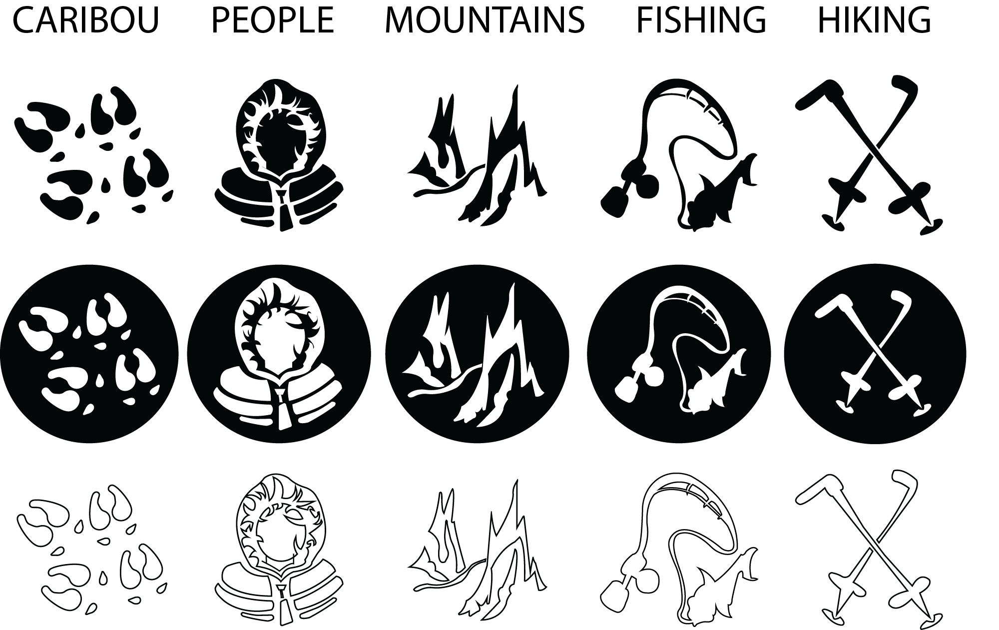
Iconography
Mockups
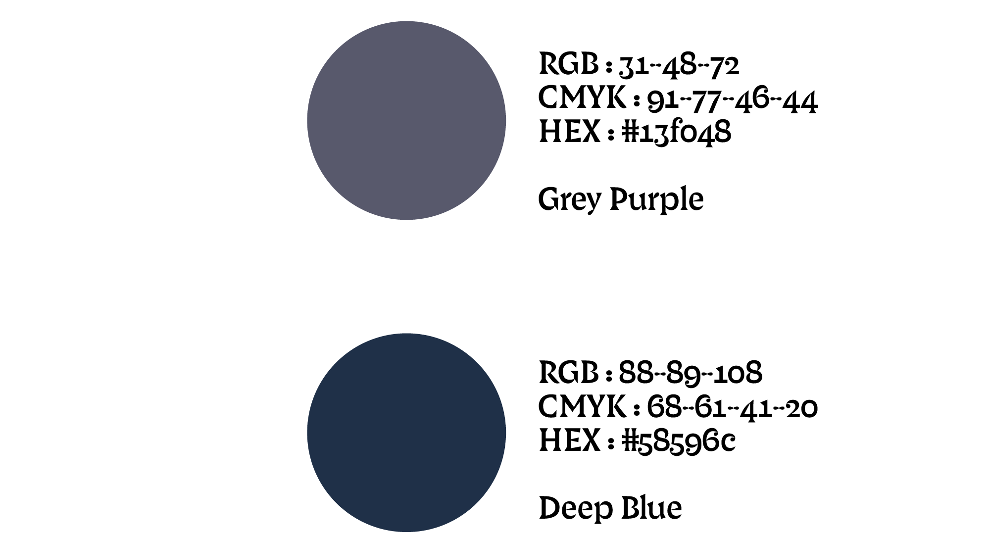
Color Theory
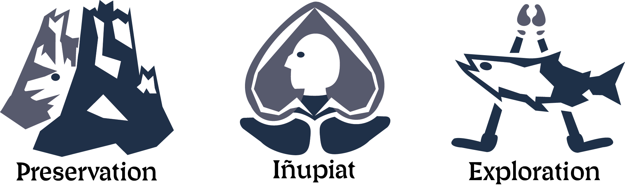
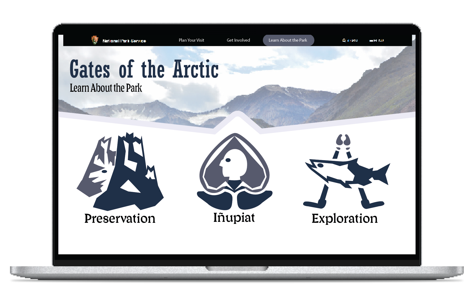
Three icons that thoroughly represent preservation, the Inupiat people, and exploration at the Gates of the Arctic National Park due to cohesive style, color, and typography choices. Through research, I learned that the Gates of the Arctic has a deep history of the Inupiat tribe, the migrating caribou herds, and the natural landscape of the mountains they call “the gate to the arctic.” Striving to include these different key elements of the park, I decided to work with clear positive and negative shape relationships. I also utilized imagery that is both widely recognizable, but also specific to the park. Incorporating aspects of the caribou in each icon serves as a reminder of their wide-reaching importance to the park and creates cohesion across the set. Cool colors amplify the duality of the park, showing that it’s both a serene and potentially treacherous landscape to explore. With bold shapes, sharp edges, and individualized details, these icons are unique to the Gates of the Arctic and serve as a fun yet professional way for viewers to engage with different experiences the park has to offer.
Process
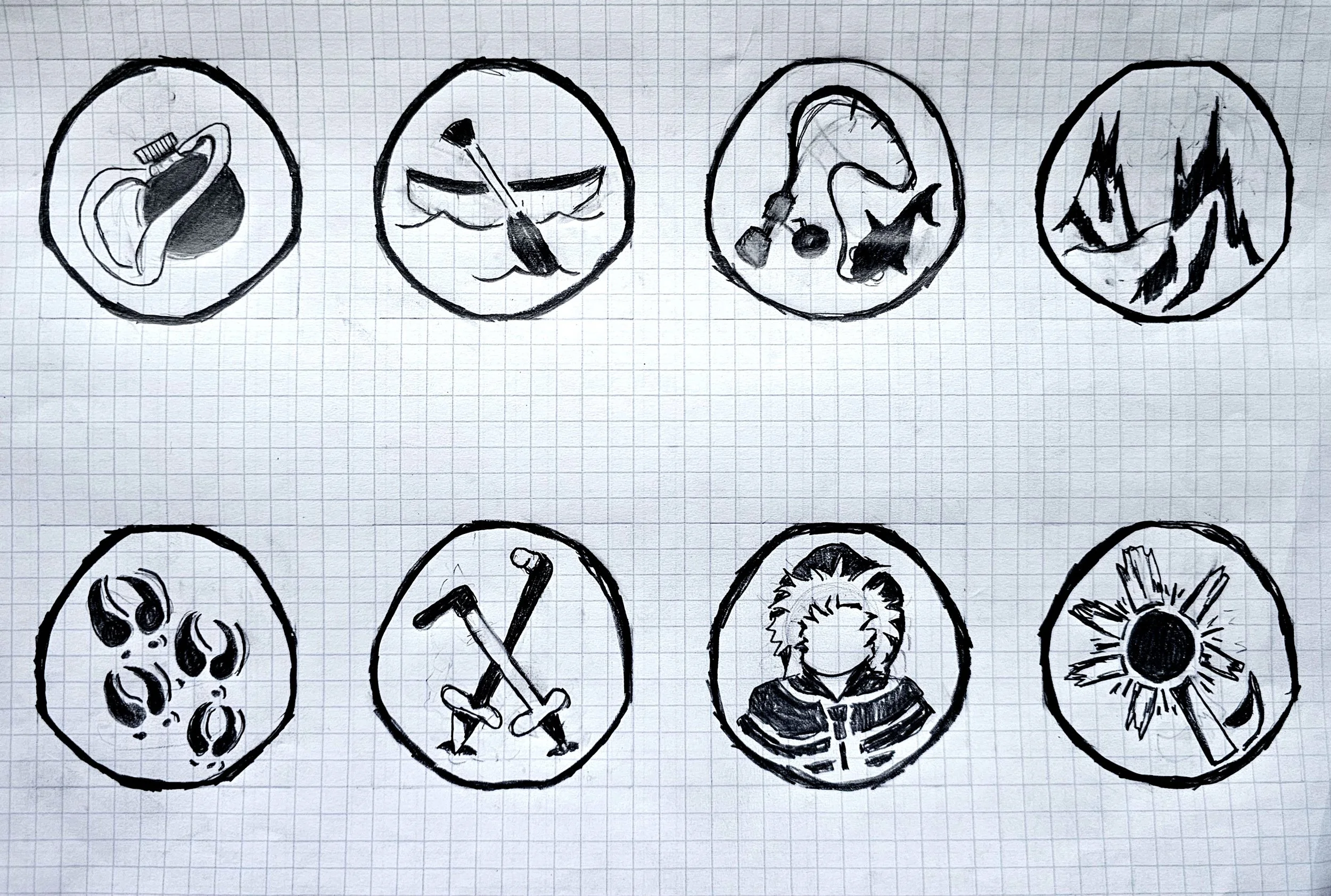
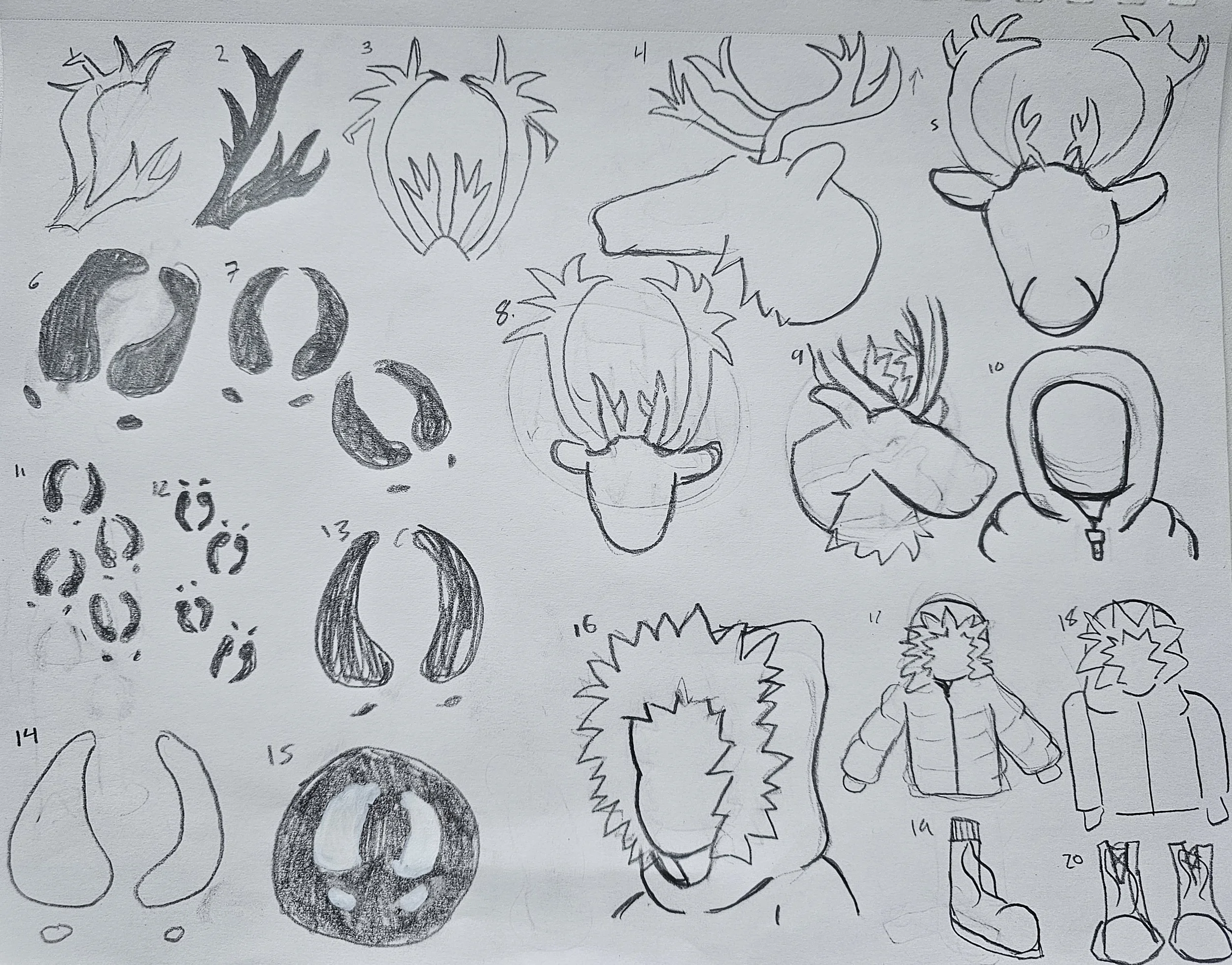
Thorough research and development went into the ideation for these logos. leaning about the importance of the Caribou was a huge impact on the way that the icons turned out.
Color
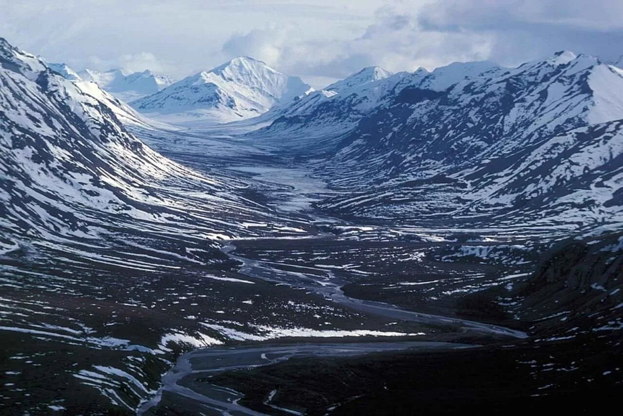
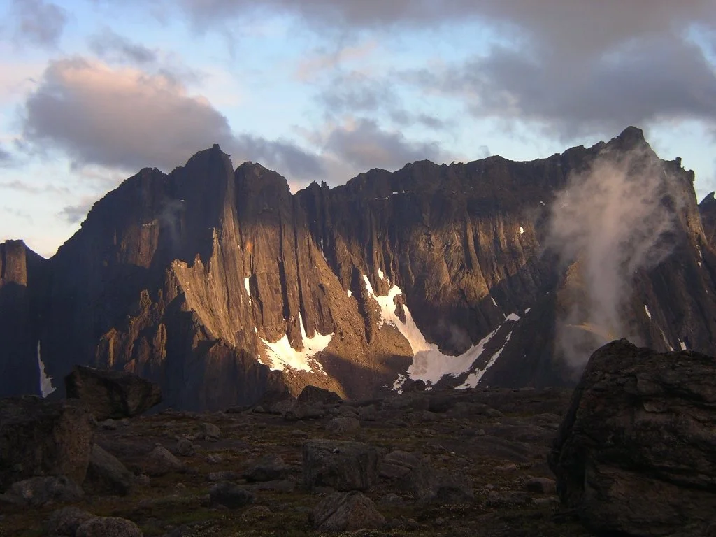
The color of the icons was inspired by images of the parks natural landscape, making the icons connected specifically to The Gates of the Arctic, rather than any other park.
Type
The typography paired with these icons connects back to the history, and the natural organic shapes that occur in the park.

Icons
The final icons are a playful yet refined representation of the Preservation that the park hold in high importance, the Iñupiat people, the indigenous group that still inhabits The Gates, and the Exploration that the park offers to those coming to visit. All of the icons feature a connection to the caribou, the heart and soul of the flow of The Gates of The Arctic.
Reflection
If I were to do this project again, or expand on it, I would love to create a wider range of icons in the set. The current set is a unique and fun take on the Gates of the Arctic, but I would also enjoy making a set that aligns more closely to the professional and clean style of the National Parks website.