
Boswell Book Company Rebrand
PROJECT FOCUS
Research
Brand Analysis
Rebranding
Logo Creation
Color Theory
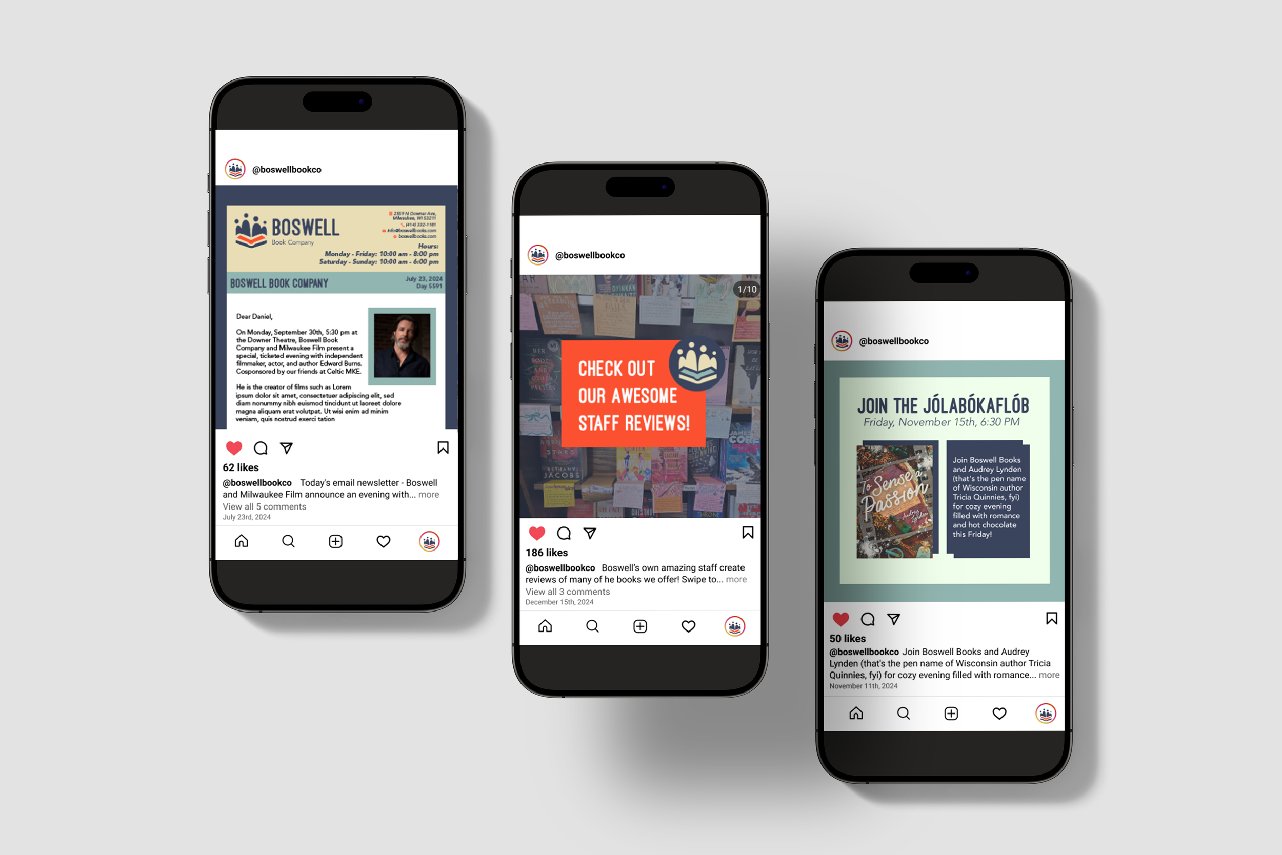
The Boswell Book Company rebrand creates a fun and inviting new visual identity for a local Milwaukee book seller through meaningful design changes in the logo, wordmark, and overall visual identity of the company. Transitioning to the Everyman archetype, the new identity needed to be inviting, inclusive, and community focused. The logo highlights the community that Boswell creates, both representing the specific community of people that Boswell serves, and the way that reading in general brings people together. With a welcoming rounded sans serif wordmark and a color palette that screams connection, trust, and stability, the Boswell Book Company rebrand invites customers to engage before they've even entered the building. This project highlights my personal dedication to research and thoughtful design changes, finding a reason for each choice made in the process. I activated the brand successfully by including many ways that the new identity can be brought into existing products, such as mugs and pricing stickers. The rebrand is collectively displayed in a thorough brand guideline that explains in depth how Boswell would be successful implementing the new visual identity and showcases a new brand identity that invites anyone to experience what Boswell has to offer.
Process
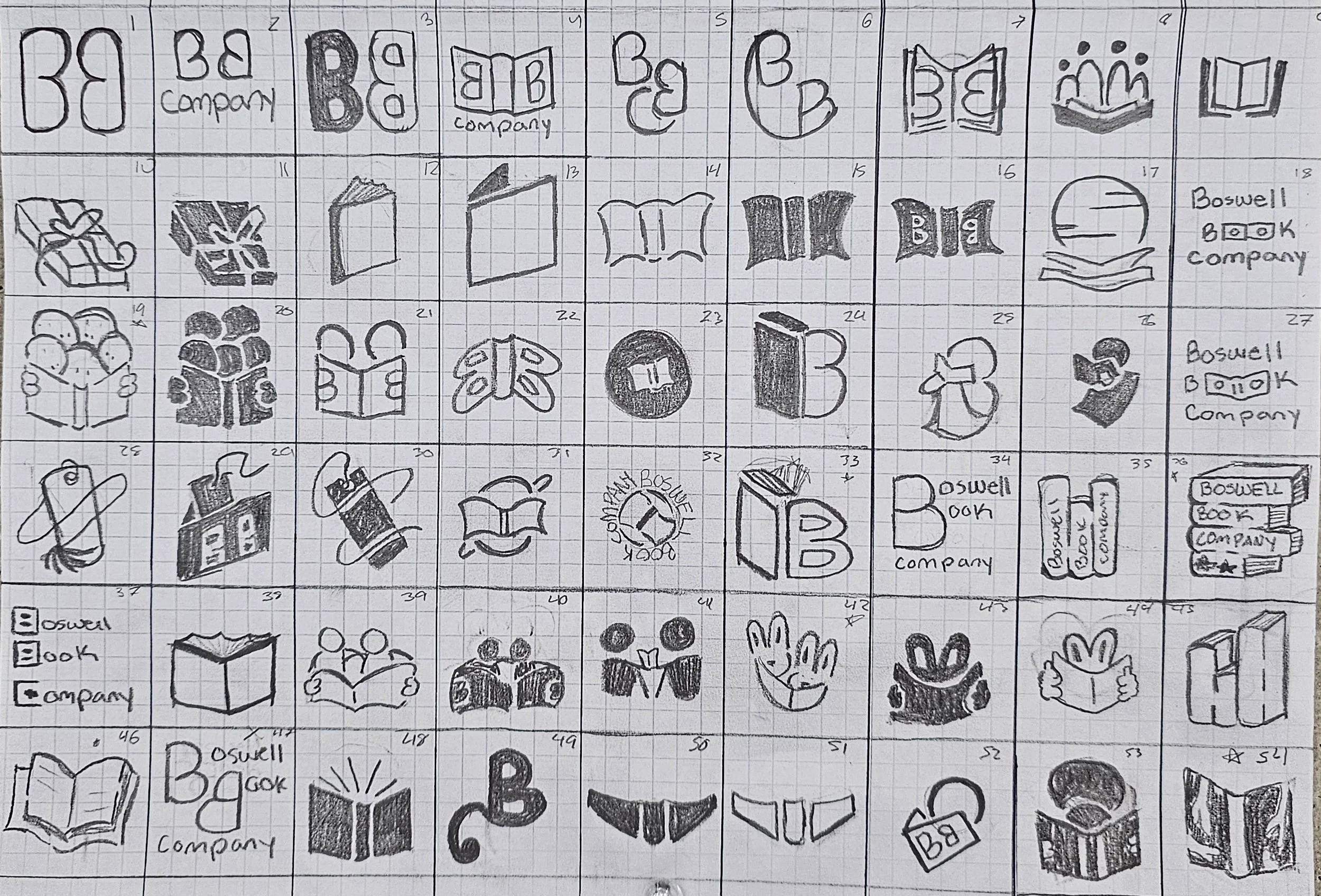
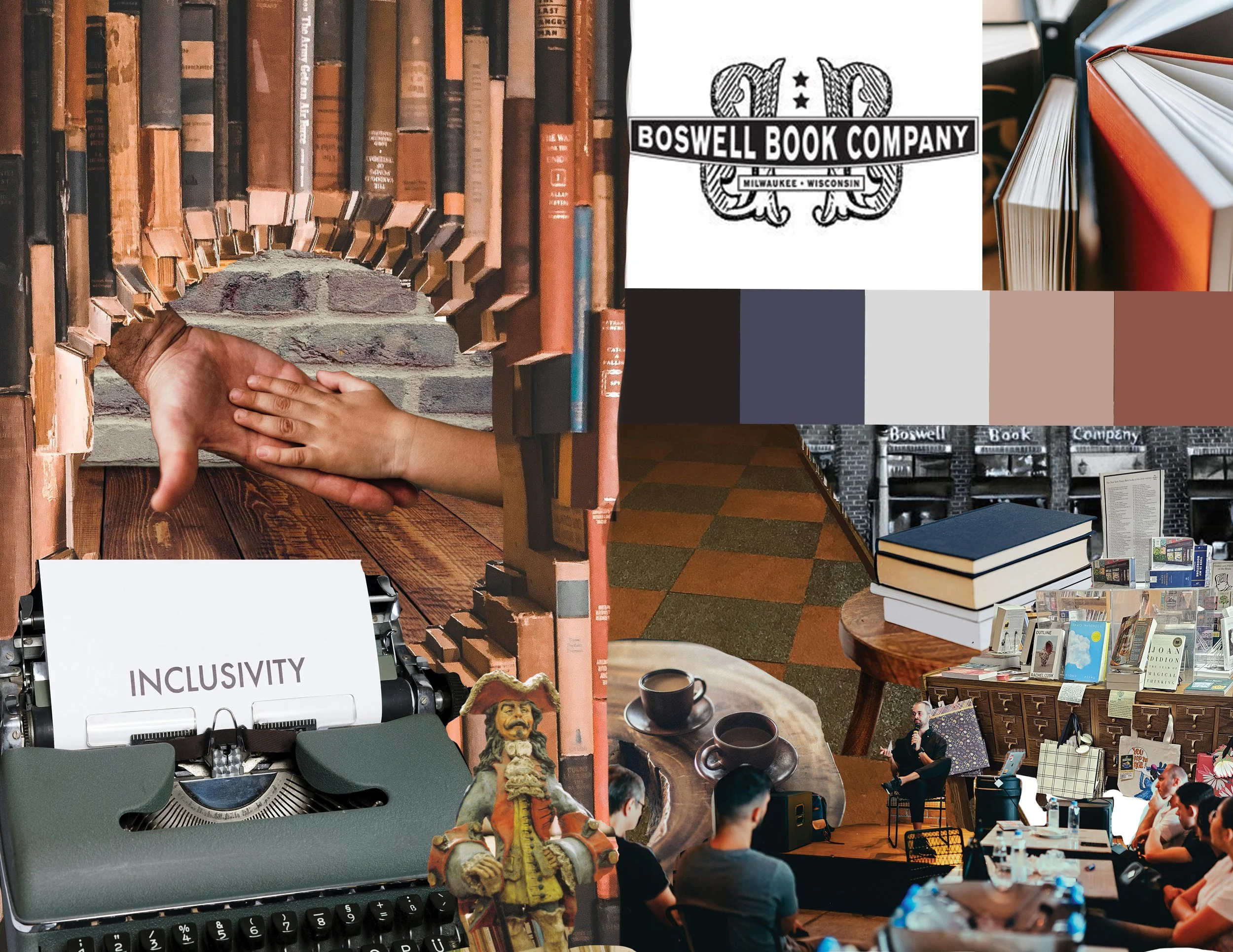
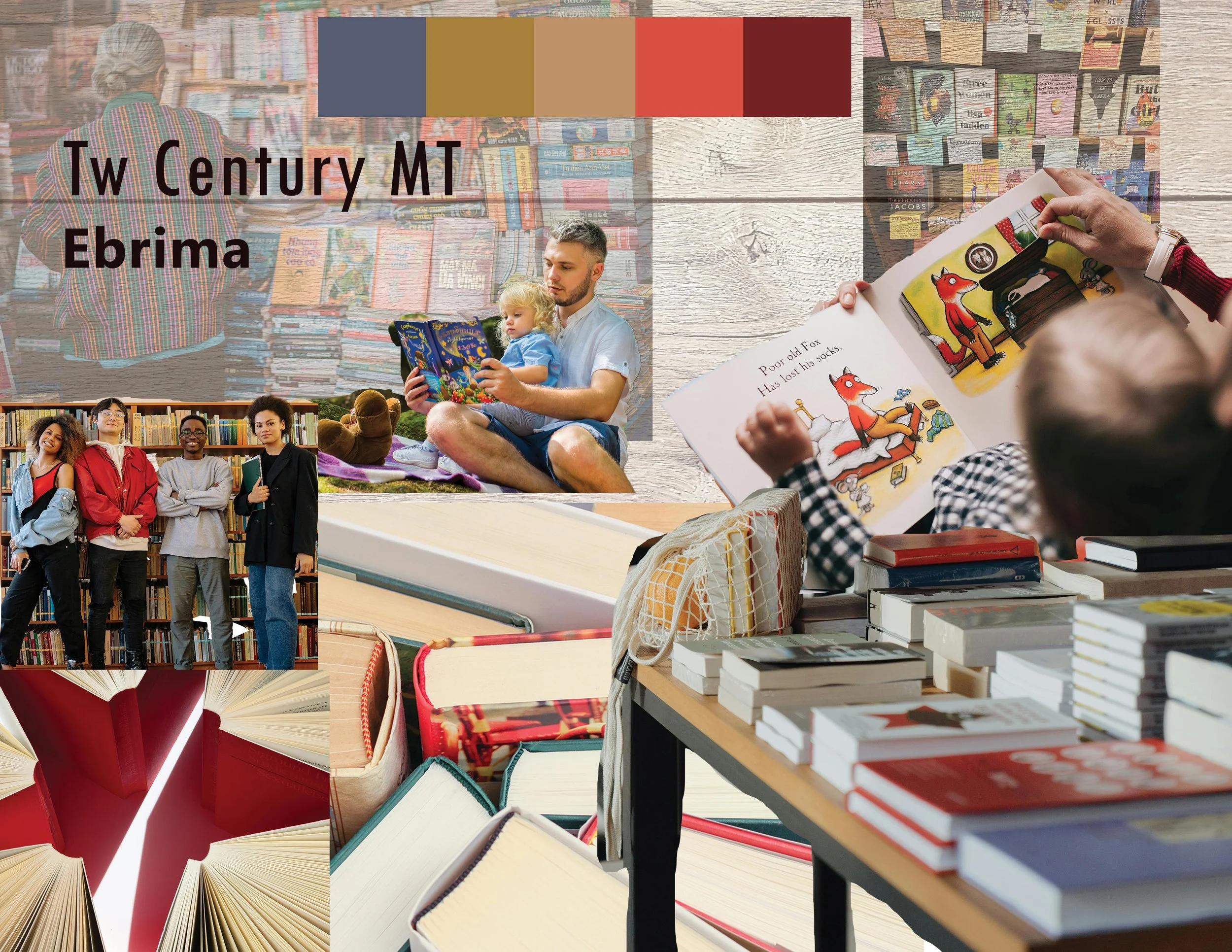
Through mood boarding, word mapping, and sketching, I created a wide range of options for the client that were then critiqued and refined based on peer feedback.
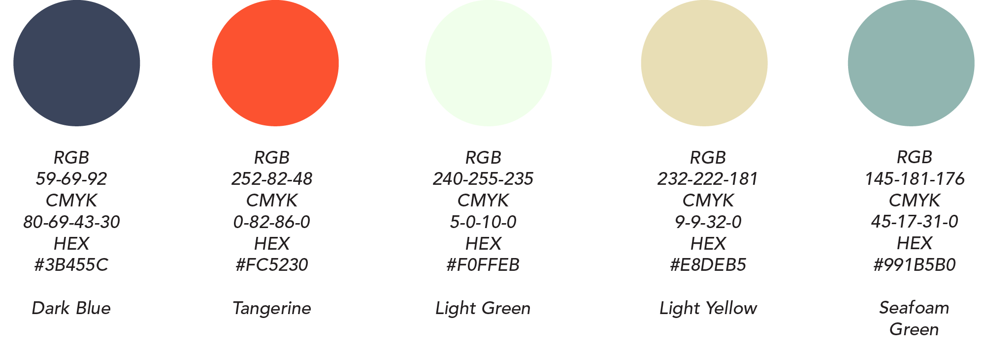
Color

Each color in the new Boswell Book Company Palette reflects the key values of the company: blues for trust and reliability, orange for creativity, and yellow for happiness and community.
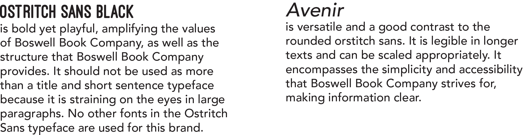
Type
The typography pairing for Boswell Book Company exudes approachability, inclusivity, and access, pairing well with the new brand identity.
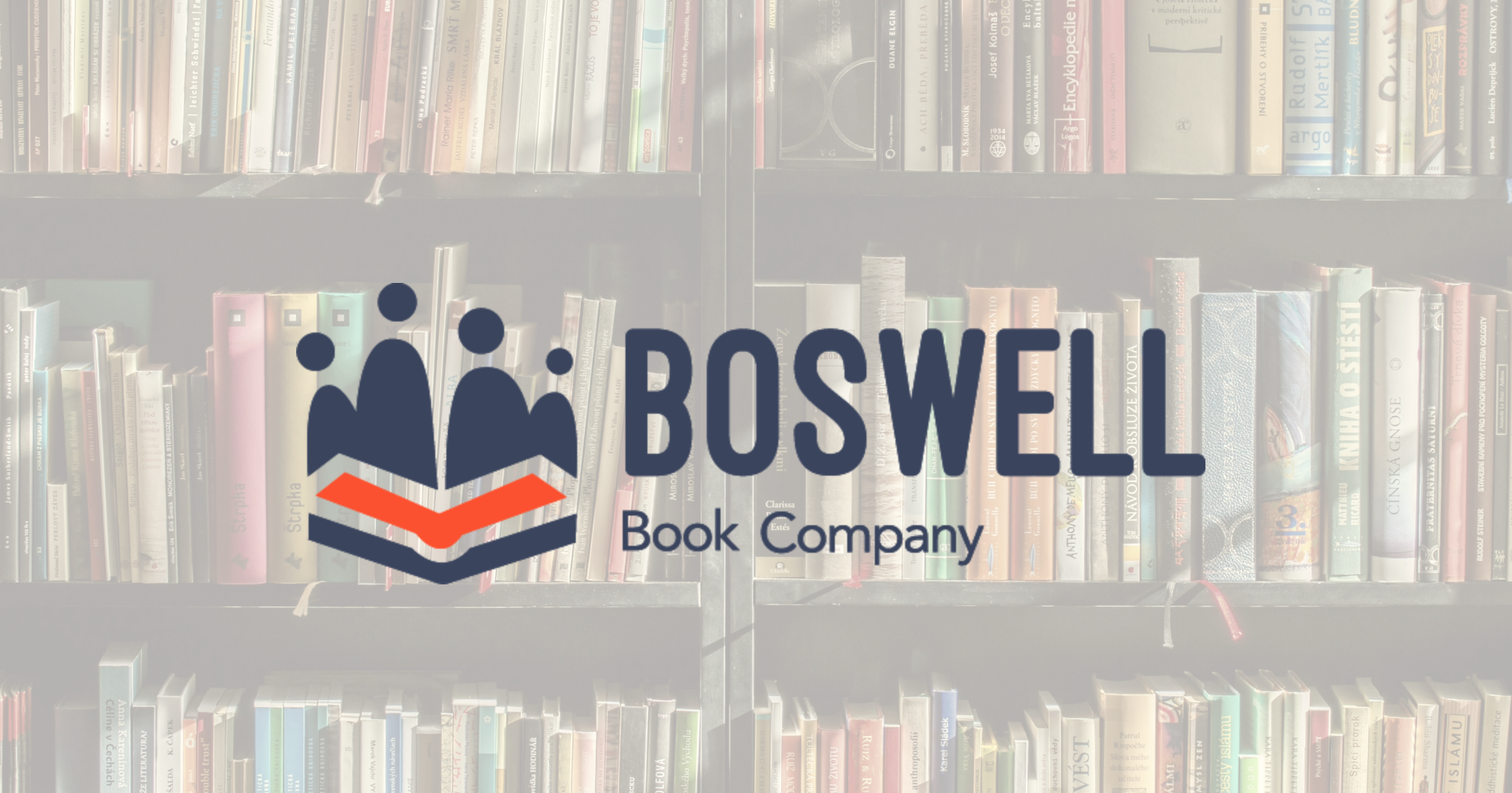
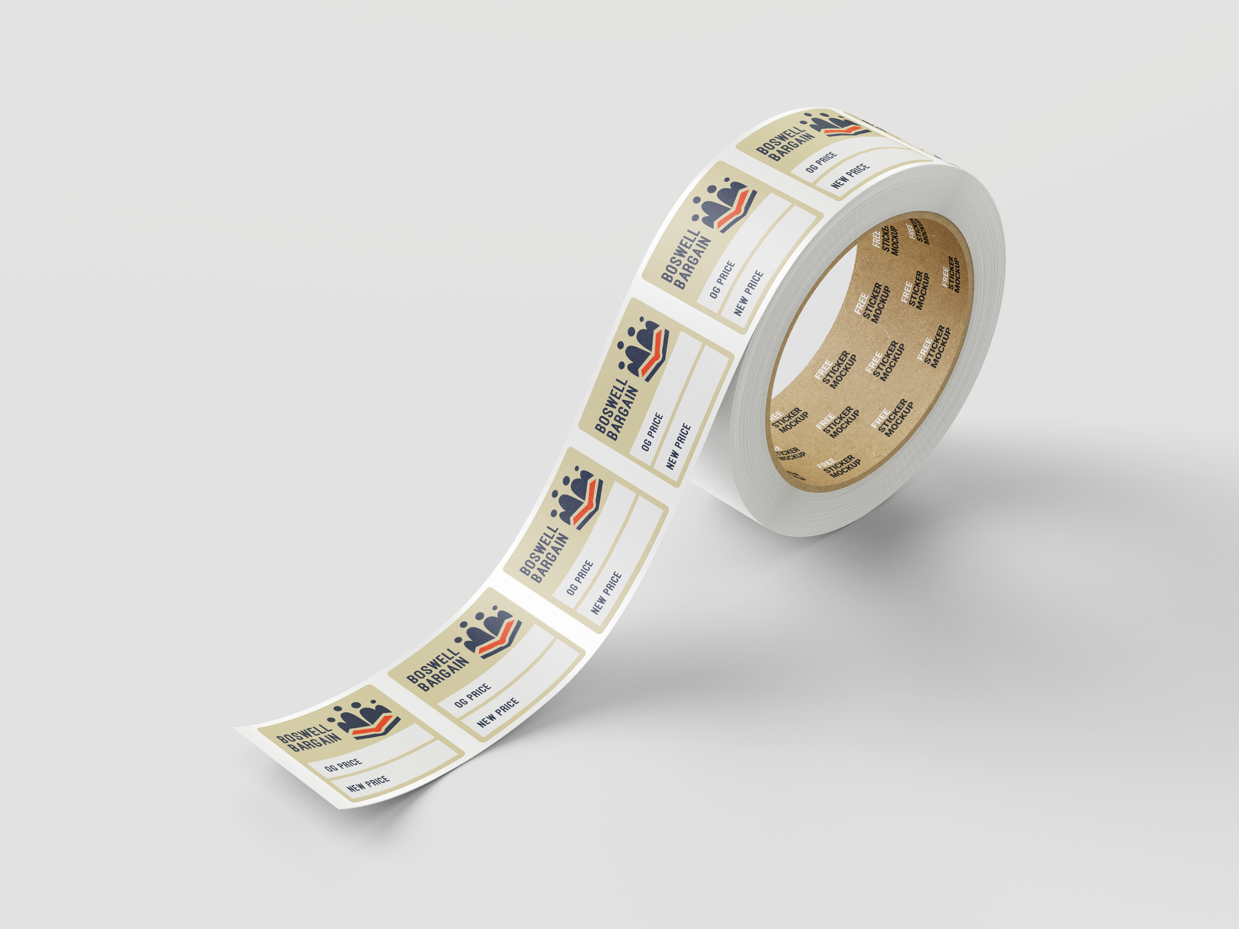
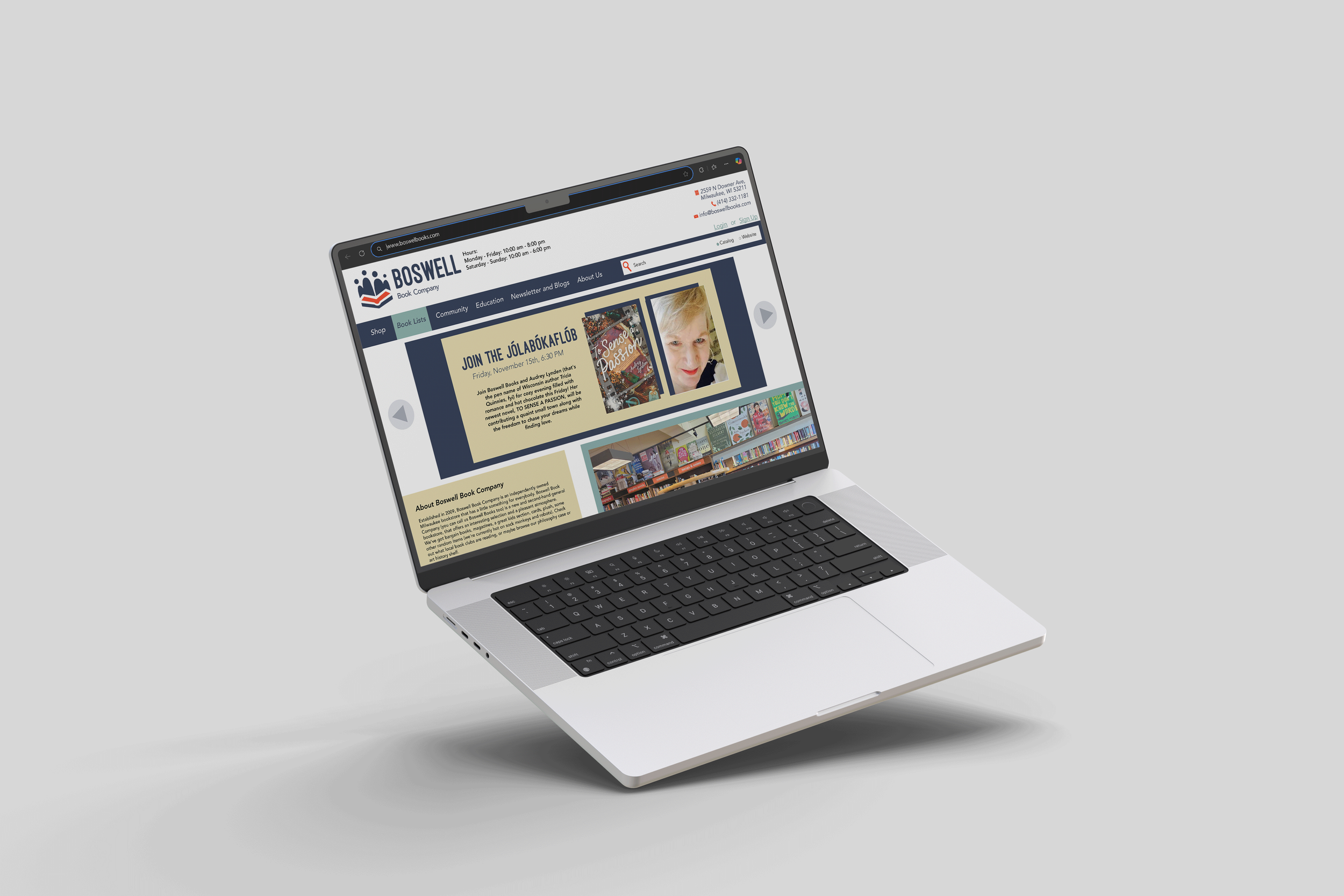
Logo
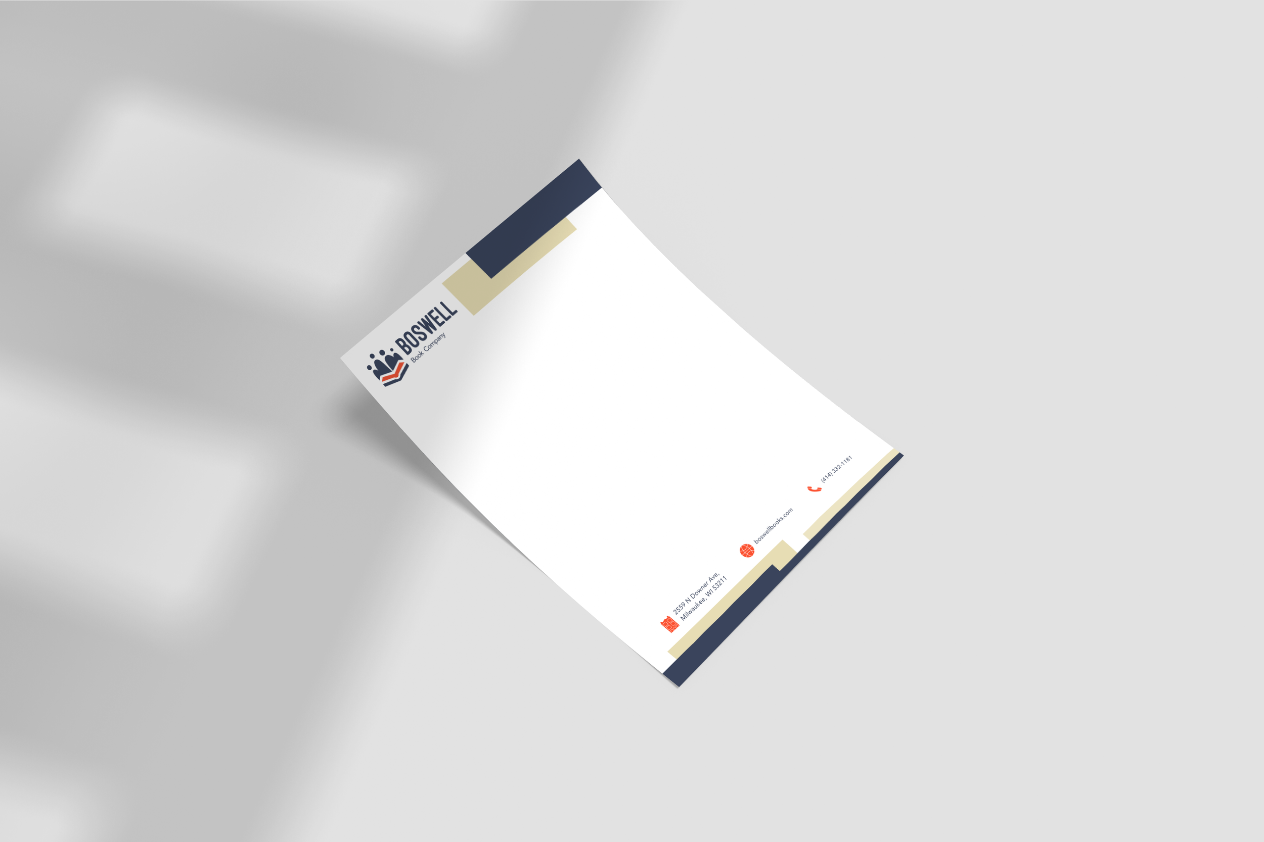
The final Logo, Brandmark, and Wordmark for Boswell Book Company engages with the new brand identity by utilizing geometric shapes, easily decipherably iconography, and a clean layout to maximize inclusivity and approachability. It fits perfectly on a variety of mockups and items that the store would use or provide.
Reflection
This project allowed me to refine my skills in logo creation, brand identity, research, and how to deliver a final product to a client in a clean, professional, and thorough way. I would love to expand upon this project and push the designs and brand identity further. I think that this rebrand would create a wider reaching and accessible image for Boswell Book Company.